Creating a smart and distinctive style for this boutique property developer
Professional yet modern
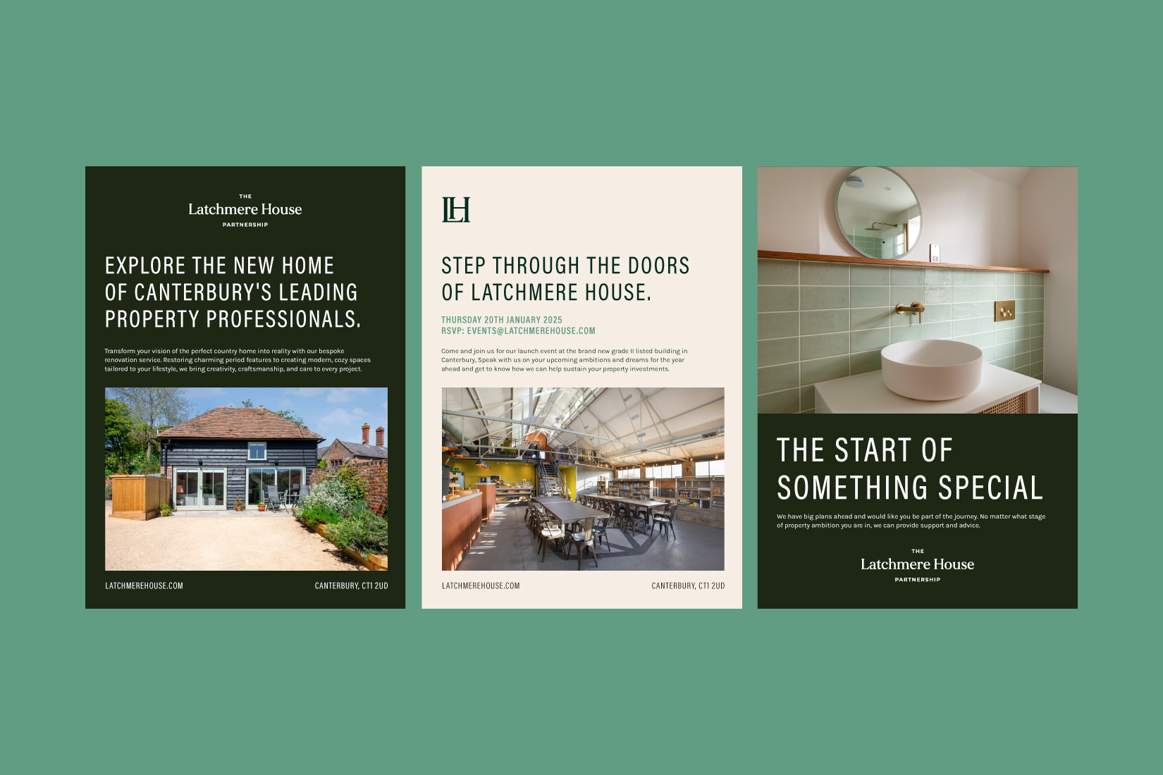
Property developers and industry experts reside in Latchmere House, the new home for an established group of businesses all working under the same name. The brand look and feel for this business needed to be professional, modern with subtle elements that provide a backdrop for great photography.
The main asset for the brand design was the logo, with contemporary typography elements and a matching monogram to use alongside the full wordmark. The dark green contrasting with the pale yellow colours to create a simple but striking brand look. Brand fonts were chosen to be omnipresent, and not get too involved in the design materials, promotional brochures or for use on the responsive website.