Ultra LEDs
Creating a new logo that is bespoke to the industry and complimenting brand assets at every touchpoint.
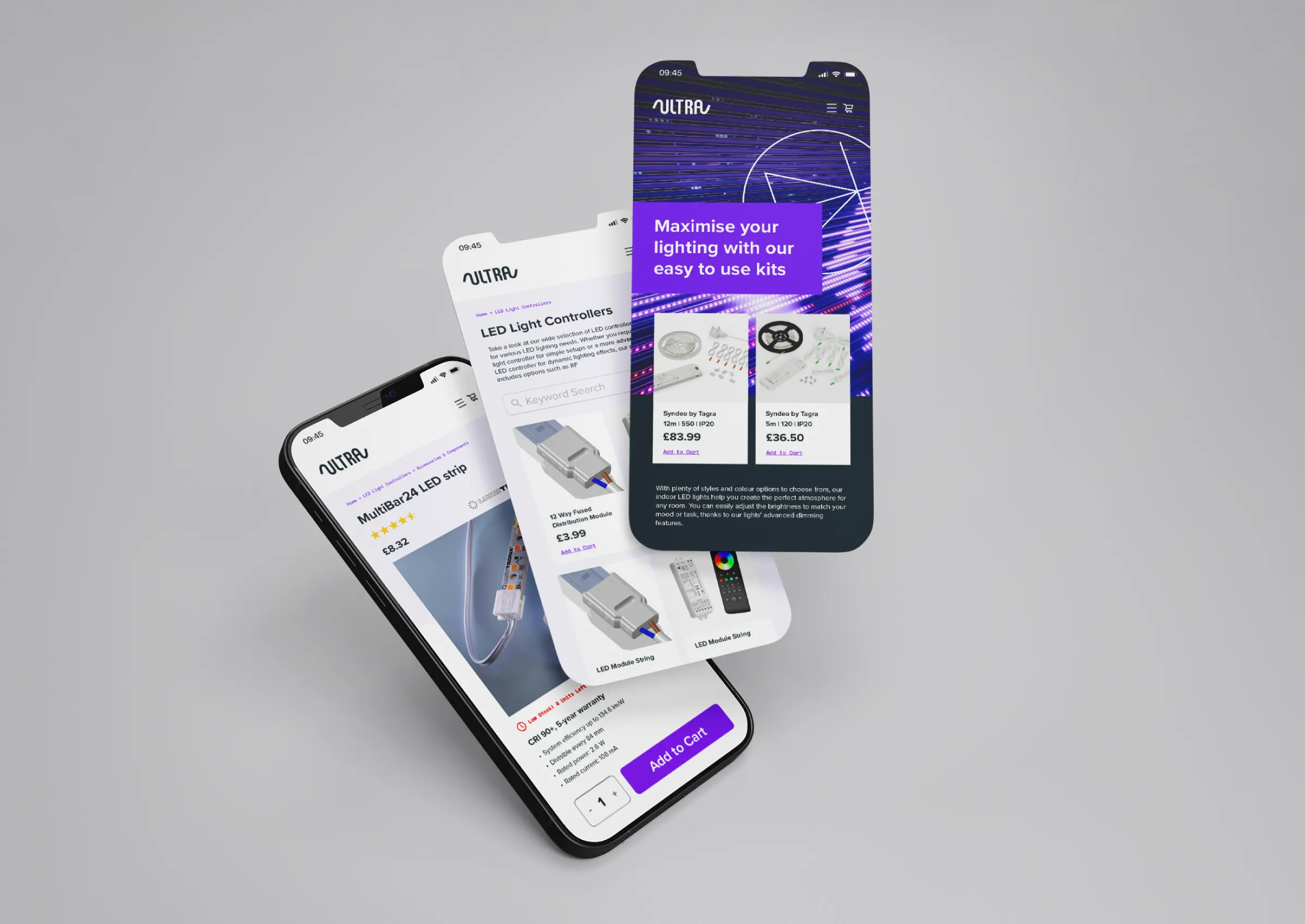
Working with B2B Campaign Agency: UPP B2B
Bright and Bold
This small local business provides LED lighting options to both consumers and industry professionals, this made the strategic direction of the brand an important factor to consider.
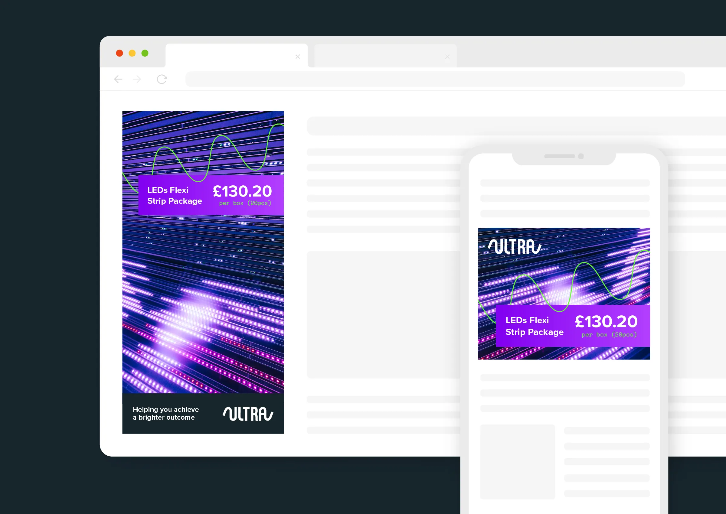
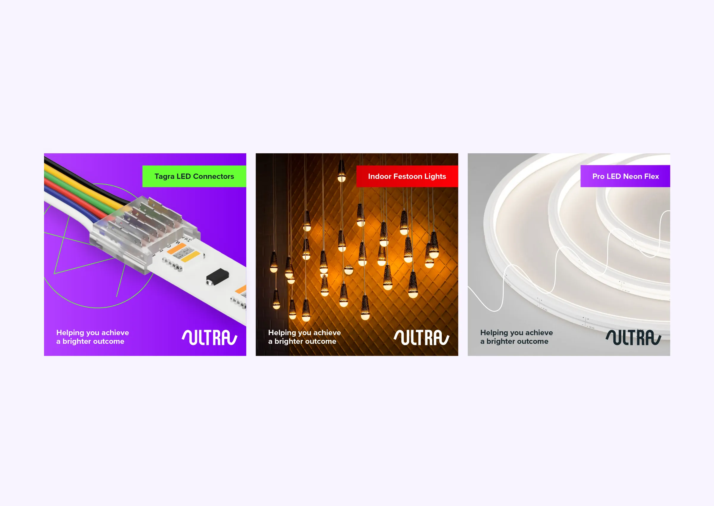
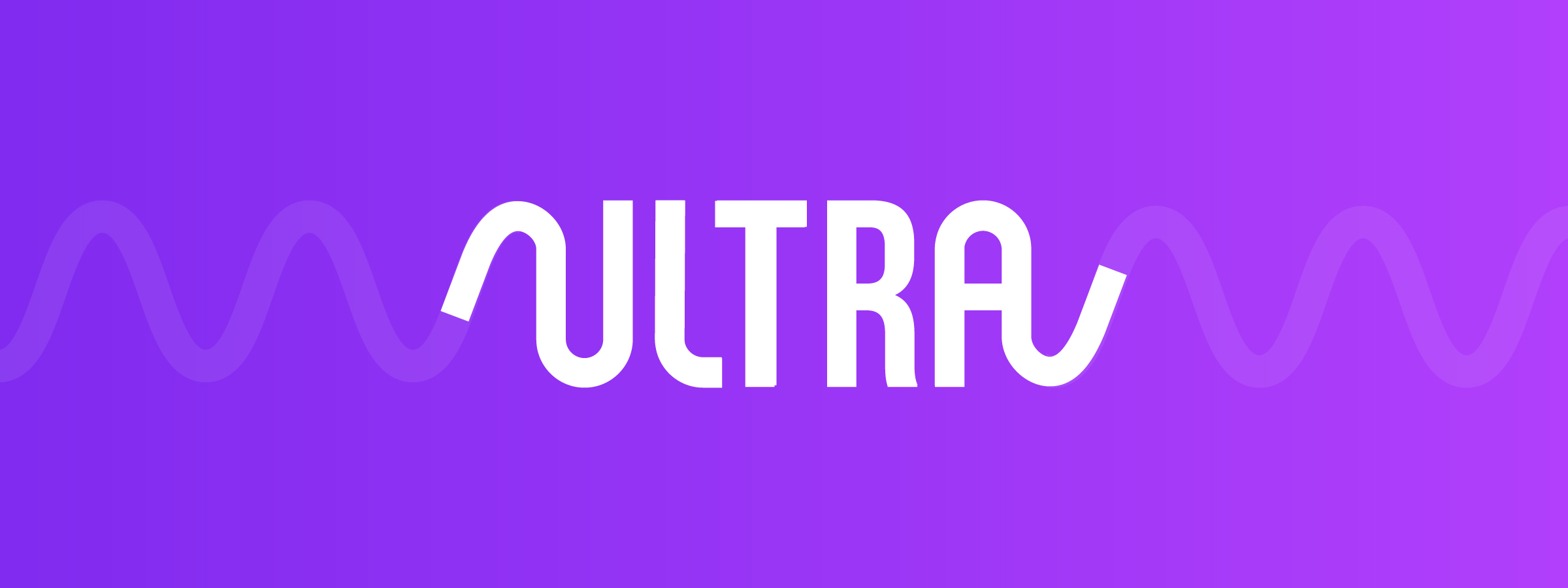
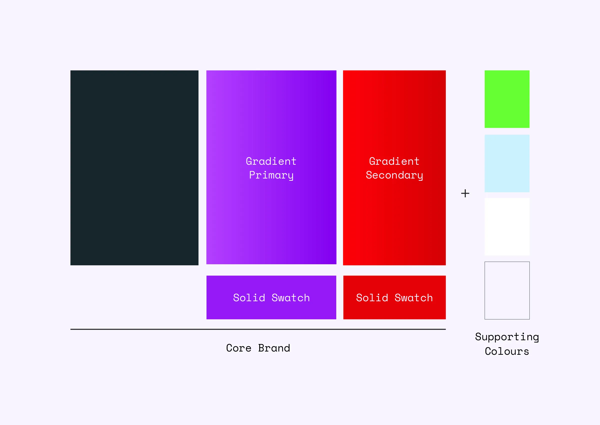
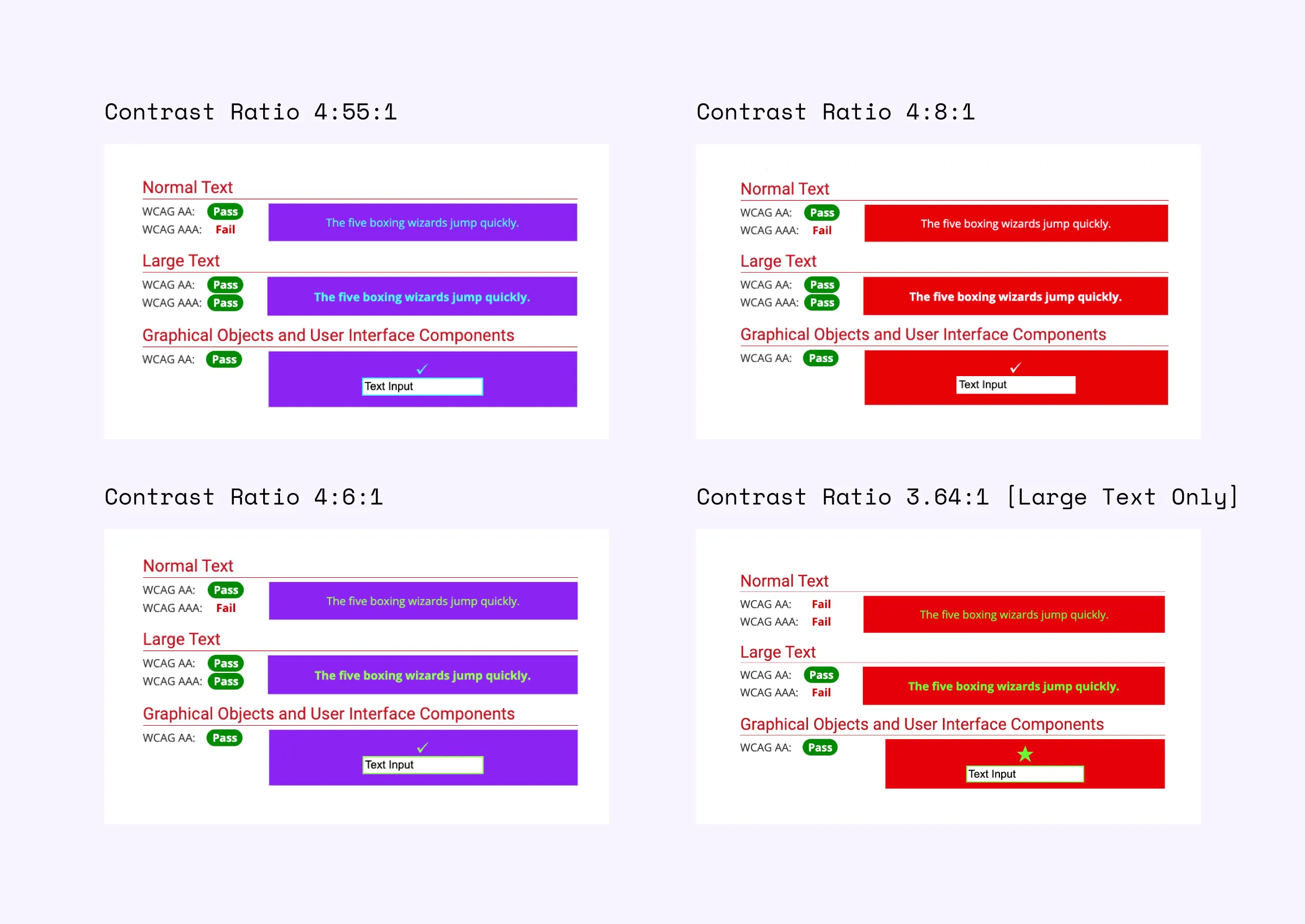
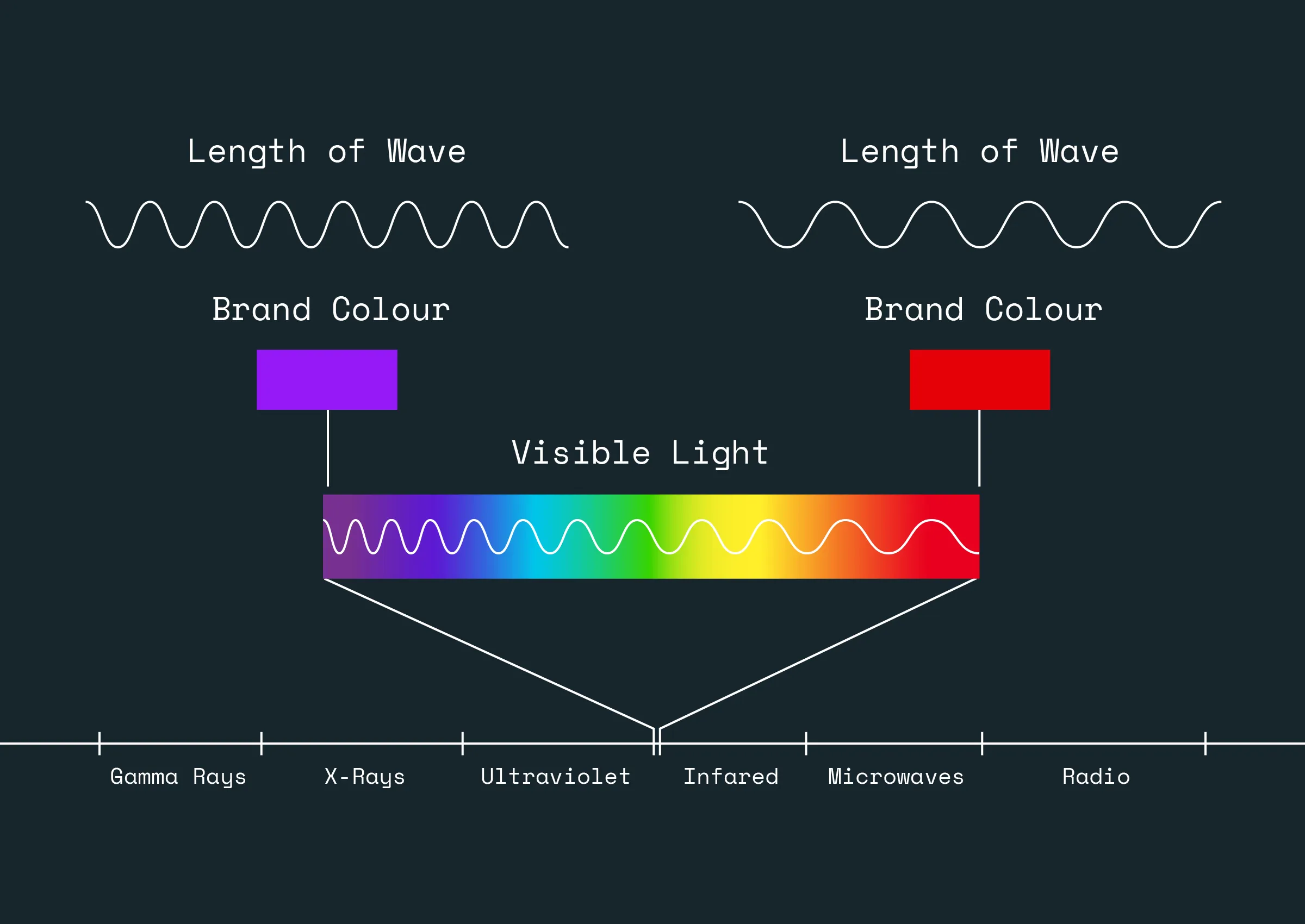
The creative part of this brief was to ensure the new visuals were exciting enough to stand out in a saturated market. Focusing on bright, vibrant colours for this brand, linking them to the electromagnetic spectrum. This interesting and unique concept of the light spectrum formed the rest of the brand visuals, including the logo and supporting graphics.
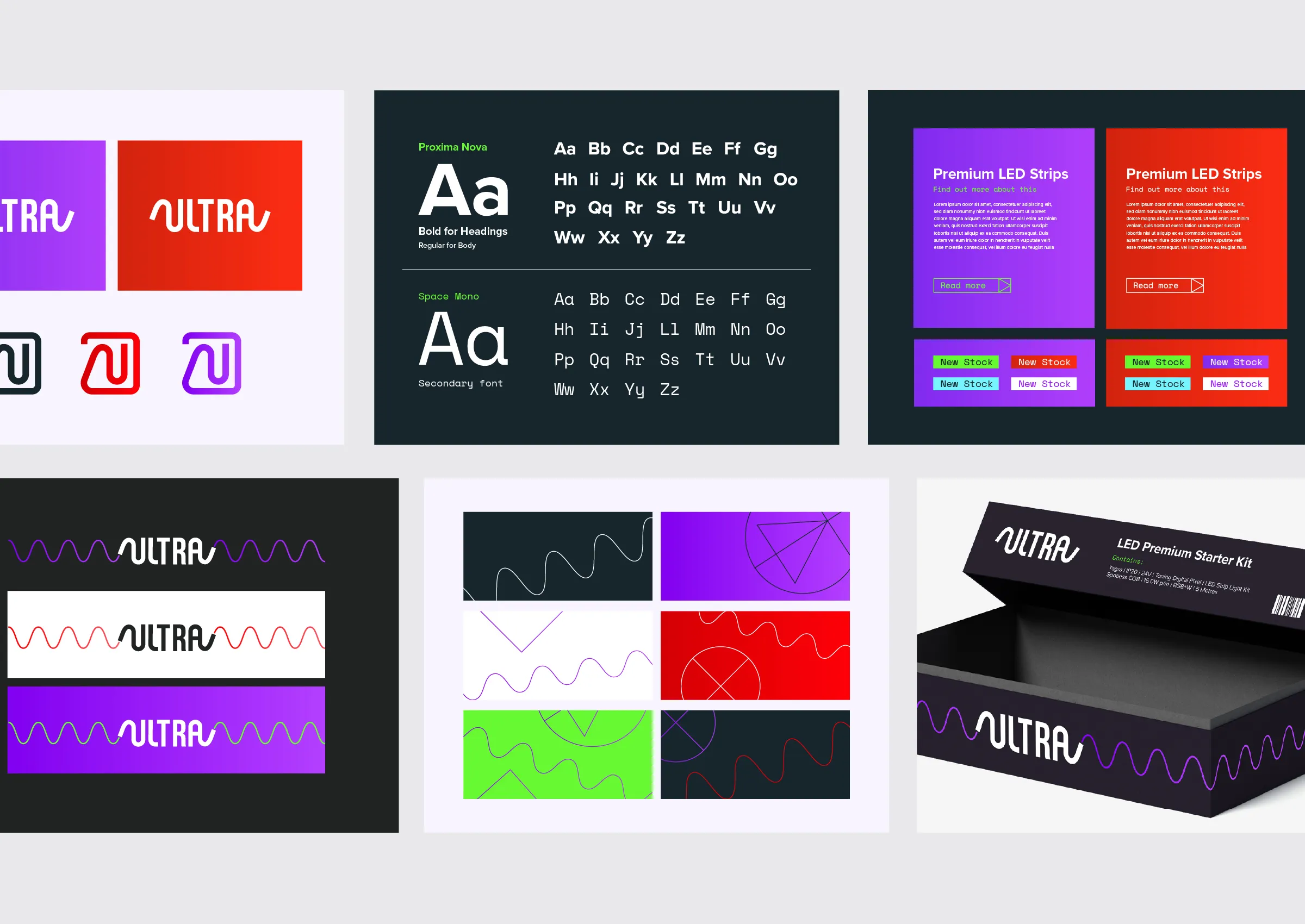
With some fine tuning, around 80% of the colour combinations passed WCAG AA guidelines and around 60% WCAG AAA, making the brand functional, flexible and eye-catching online.
Completing a Brand Identity
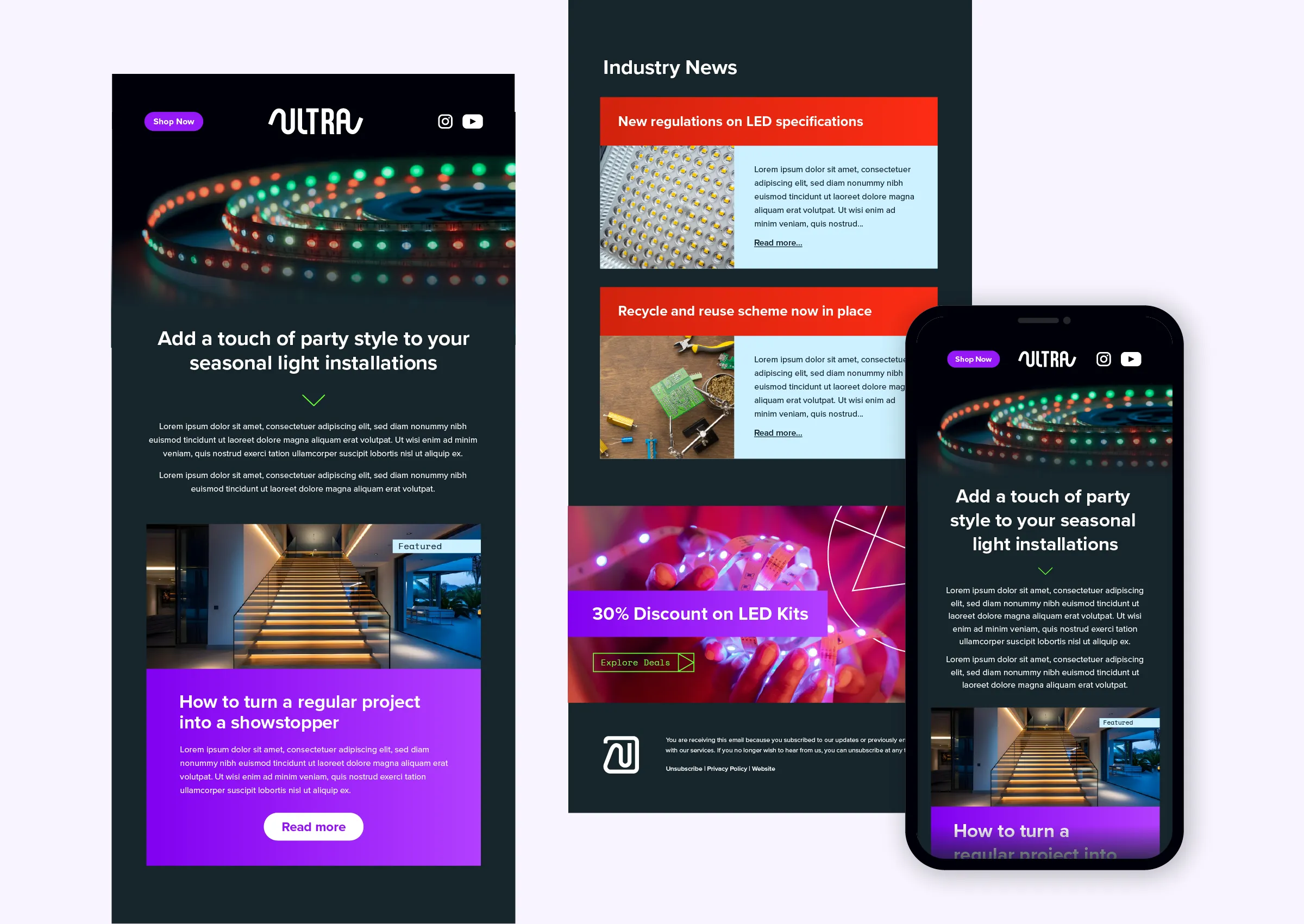
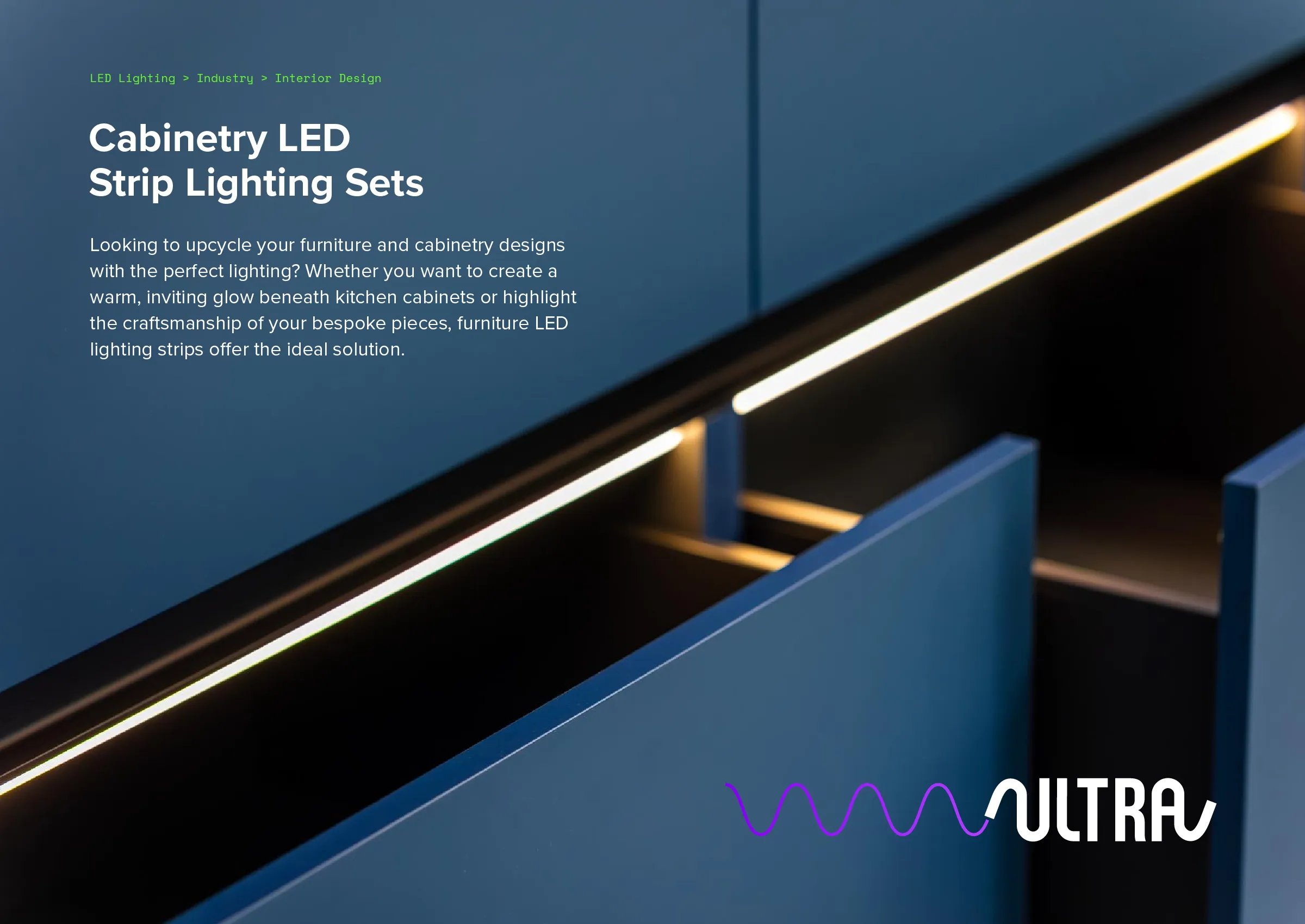
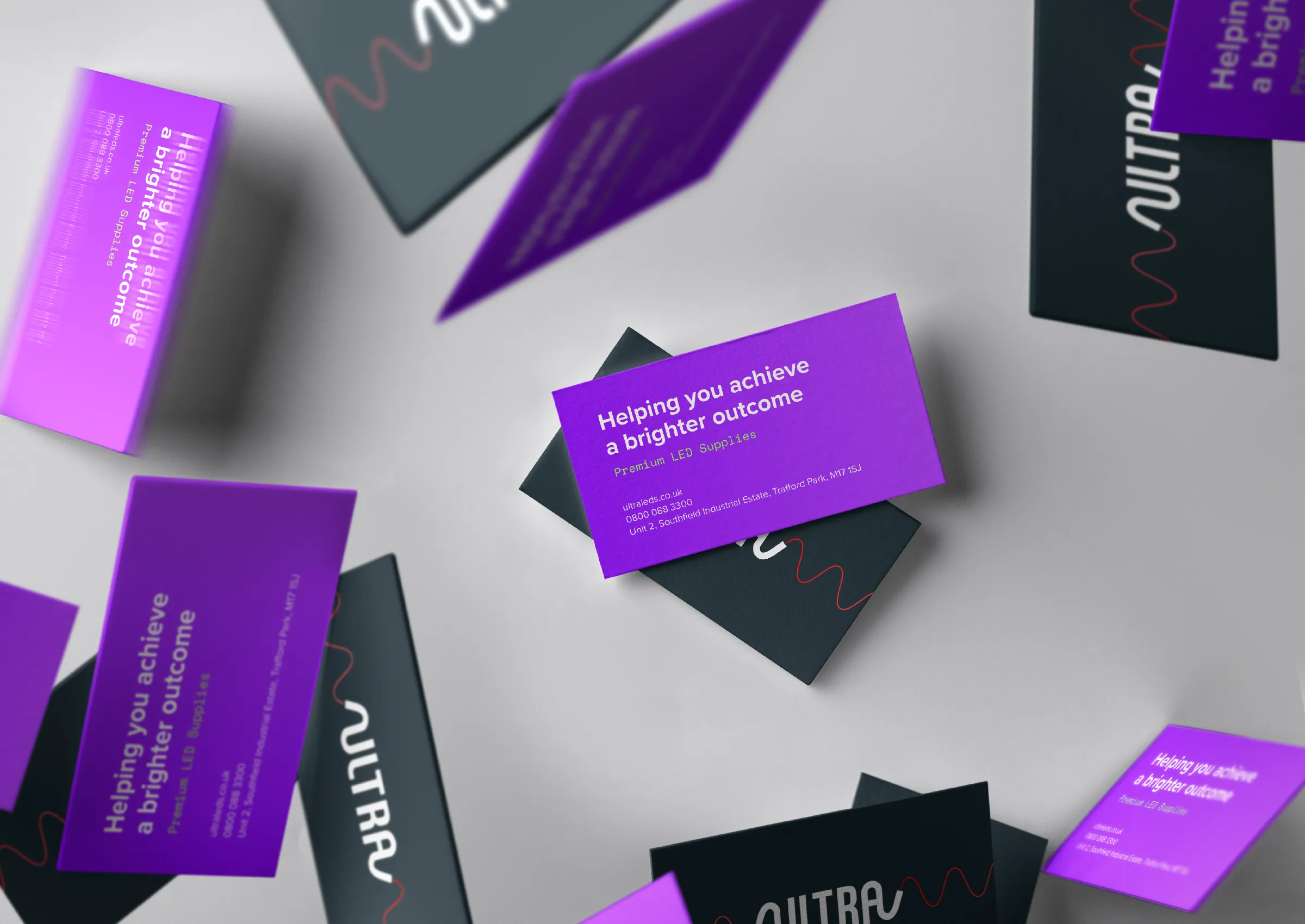
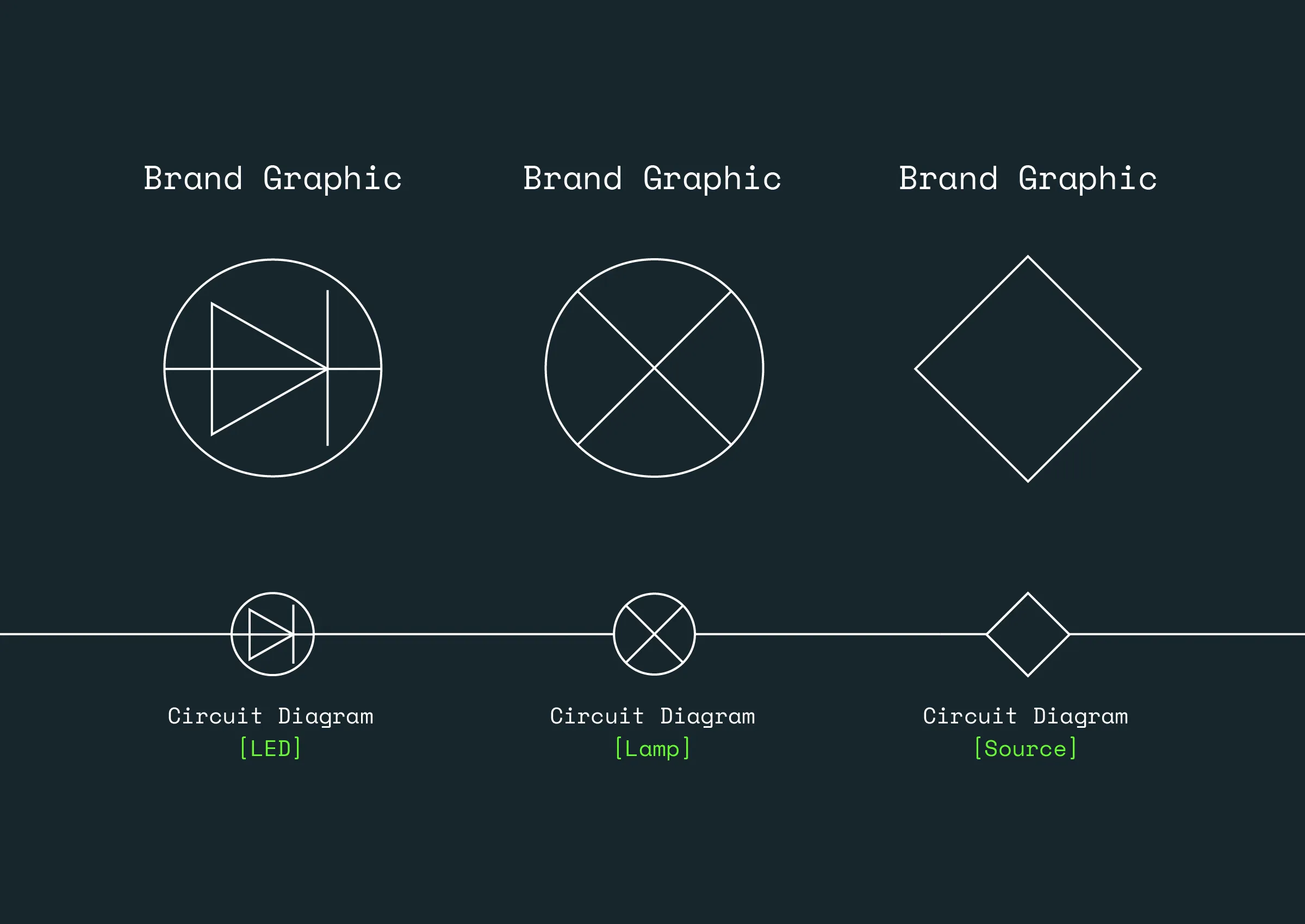
The logo and the curves formed a key part of the visuals, so expanding on this was the next step, to build out marketing assets for the team to create. The actual light waves themselves could be used as patterns, or as overlaying graphics to add an additional brand touch.
Alongside these waves, electrical circuit symbols could also be used in many different ways. The symbols could be scaled large and small, hanging of the side of layouts for both digital assets and printed materials.